

UX & Conversion Strategy
Enhancing user experience is the top priority in digital projects. Let's make things easier for everybody!
✦
Full-Funnel Audit · Conversion Strategy
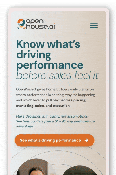
OpenHouse CRO/UX Audit & Conversion Strategy
Identifying conversion blockers and translating UX friction into growth opportunities.
When OpenHouse faced underperforming conversion rates, I led a CRO/UX audit to uncover behavioral friction, structural inconsistencies, and missed optimization opportunities. The goal wasn’t only a visual refresh: it was to create a prioritized roadmap aligned with revenue-driving actions.


Business Context
OpenHouse’s platform showed strong traffic acquisition but underperformed in key conversion points. Users were navigating the product, but hesitation and friction disrupted decision flow.
Key KPIs impacted:
-
Lead submission rate
-
CTA click-through rate
-
Funnel progression
The risk:
Ongoing investments in traffic without addressing structural optimization will lead to greater inefficiencies and obstruct scalable growth.
Hypothesis & Strategy
I identified that the core issue wasn’t awareness: it was clarity and confidence.
Users lacked:
-
Clear value articulation
-
Decision hierarchy
-
Frictionless progression between steps
Hypothesis:
If we reduced cognitive load, clarified messaging, and aligned CTAs with user intent stages, conversion flow would become more intuitive and measurable.
I translated audit insights into a clear prioritization framework, identifying which friction points were directly affecting decision confidence and conversion momentum, and structuring them into a hypothesis-driven experimentation roadmap.


Solution:
I delivered a structured CRO audit including heuristic UX evaluation, behavioral friction mapping, messaging clarity analysis, and funnel drop-off assessment.
Beyond strategy, I led the UX/UI redesign phase to ensure every proposed improvement aligned with the defined north star: reducing friction and increasing decision confidence. This included CTA repositioning, hierarchy restructuring, content simplification, and interface refinements grounded in behavioral principles.
Rather than treating design as cosmetic execution, each interface change was directly tied to a conversion hypothesis, ensuring alignment between UX decisions and measurable growth objectives.

Trust & Behavioral Design · Scalable System
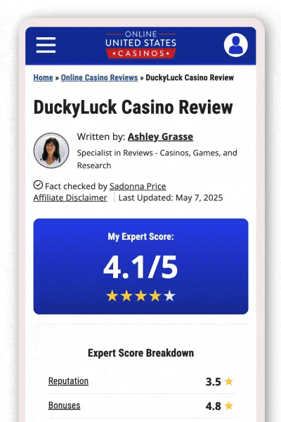
BREV Template
Designing a Trust-Driven Review System for Conversion Optimization
OnlineUnitedStatesCasinos.com depended heavily on affiliate revenue, but users were increasingly skeptical of polished, overly promotional casino reviews. Trust erosion was directly affecting click-through behavior and long-term credibility.
I led the creation of BREV: a scalable review framework designed to prioritize authenticity, relatability, and behavioral trust triggers over traditional “perfect” affiliate copy.
By restructuring review architecture, tone, and user flow, we repositioned reviews as credibility assets rather than promotional content. Strengthening user confidence and improving perceived transparency across the platform.


Business Context
What was happening?
The platform relied on affiliate conversions from casino review pages. However:
-
Reviews felt overly optimized for promotion.
-
Content lacked human relatability.
-
Users had difficulty distinguishing genuine insights from affiliate intent.
KPIs that mattered:
-
Affiliate click-through rate (CTR)
-
Engagement time on review pages
-
Return visits
-
Scroll depth and interaction with key sections
The risk:
If users perceived reviews as biased or promotional, trust friction would reduce clicks, damage brand authority, and lower long-term affiliate performance.
In affiliate environments, trust = revenue sustainability.
Hypothesis & Strategy
What I detected:
Users don’t distrust casinos: they distrust “perfect marketing”. The more polished and sales-driven the review felt, the less believable it became.
Core Hypothesis:
If we increased perceived authenticity and relatability, users would:
-
Spend more time reading
-
Engage more deeply with pros/cons
-
Feel more confident clicking through
Strategic Decision:
Instead of optimizing for persuasion, we optimized for credibility.
That meant prioritizing:
-
Imperfect language over polished tone
-
Balanced pros and cons
-
Real-user scenarios
-
Transparency signals
-
Structured scannability
This was a shift from promotional UX to trust-centered UX.

Solution: The BREV Template
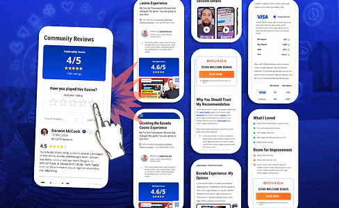
The BREV template transformed casino reviews from promotional content into a scalable trust system. Guided by the principle “BREV it: Make it easier for everyone,” we restructured our reviews to prioritize authenticity, community validation, and scannability over persuasion.
The redesigned interface surfaced community scores, enabled user participation, introduced balanced pros & cons, and aligned CTAs with natural decision moments. Instead of pushing clicks, we reinforced credibility first: shifting reviews from static editorial assets to participatory trust drivers.
Impact:
+60 pages standardized under the new framework
+30 teammates aligned under a shared content system +4% conversion rate increase within the first two months, alongside stronger engagement and brand trust signals.
Mobile-First Strategy · CRO · UX Architecture
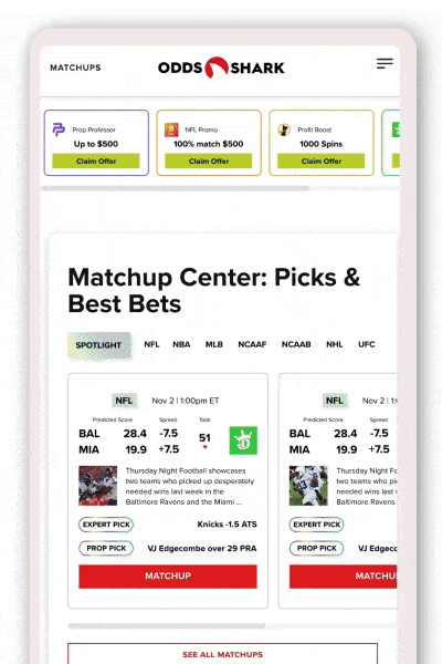
OddsShark Homepage Redesign
Optimizing first-click clarity for high-intent betting users.
I led a mobile-first homepage redesign focused on reducing cognitive load and accelerating decision-making.
The objective was to surface top picks, odds, and promotions within seconds of entry, enabling faster scanning and more confident betting actions.


Business Context
OddsShark’s homepage carried strong traffic volume but suffered from content density and competing visual priorities. Critical betting information was present but not immediately accessible.
In a high-intent environment where users seek rapid validation, excess text weight and unclear hierarchy slowed decision flow.
Key focus areas:
-
Speed of information discovery
-
Engagement with featured odds
-
Interaction with promotional blocks
The risk:
Friction at entry could delay action and reduce betting momentum.
Hypothesis & Strategy
Users arriving at the homepage were not exploring: they were validating and acting.
Hypothesis:
If we reduced cognitive load and prioritized high-value betting data above the fold, users would scan faster, find relevant picks instantly, and move more decisively toward betting.
The strategy:
-
Mobile-first hierarchy restructuring
-
Content compression and text weight reduction
-
Clear visual prioritization of odds and promos
-
Designing for scan behavior, not reading behavior
This was a shift from a content-heavy layout to an action-oriented interface.


Solution:
I redesigned the homepage structure to highlight top picks, real-time odds, and promotional highlights within immediate view.
Text density was reduced, visual hierarchy sharpened, and modular blocks introduced to support rapid scanning.
The new structure aligned content presentation with user intent. Transforming the homepage from an informational landing space into a high-velocity decision environment optimized for mobile interaction.